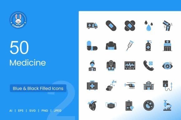
50 Medicine Blue & Black Icons: A Designer's Toolkit for Modern Healthcare Visuals
More Than Just Symbols: The Practical Power of a Cohesive Icon Set
When you're building a health-tech app, designing a clinic's website, or putting together educational materials, the visual language you choose speaks volumes before a single word is read. A scattered collection of generic symbols can make a project feel amateurish and untrustworthy. This is where a dedicated, professional set like the 50 Medicine Blue & Black Icons becomes an invaluable design asset. It's not just a random assortment of medical imagery; it's a carefully curated system designed for clarity, consistency, and immediate recognition.
The visual personality of this icon set is one of calm professionalism and modern utility. The primary color palette—a clean, clinical blue paired with a strong, grounding black—instills a sense of trust and reliability, which is non-negotiable in healthcare communication. Each icon is crafted using a unigrid system, meaning they all share the same visual weight, stroke thickness, and proportional relationships. This systematic approach is the secret sauce that transforms a collection of drawings into a powerful brand identity tool. Whether you're using the Stethoscope, Medical Heart, or Wheelchair, they will sit together on a page or screen without visual discord, creating a seamless and professional experience for the user.
Where This Icon Set Truly Shines: Real-World Applications
The true test of any design resource is its versatility across different mediums. The 50 Medicine Blue & Black Icons are built for this, provided in five essential formats: AI, EPS, JPG, PNG, and SVG. This 100% vector foundation is critical. It means the Pills icon will look razor-sharp on a 4K monitor, and the Band Aid symbol will scale perfectly for a large-format print banner at a health fair. The SVG format is particularly vital for web design, ensuring fast load times and crisp rendering on any device.
Think about the scope of projects where a unified medical visual language is needed:
- Digital & Mobile: For a telehealth app, icons like Doctor, Medical Report, and Ambulance can guide users through booking, consultations, and emergency features. Consistency here directly impacts usability and user trust.
- Marketing & Branding: A pharmaceutical startup or a new wellness brand can use the Test Tubes, Microscope, or Oxygen Tank icons across their packaging design, social media graphics, and investor presentations to build a recognizable and credible brand identity from day one.
- Editorial & Education: Textbooks, patient brochures, and health blogs benefit enormously from clear, instructional visuals. The First Aid Kit, Syringe, and Thermometer icons can break up dense text and illustrate complex procedures simply.
- Environmental & Wayfinding: In a hospital or clinic, icons for Emergency Phone, Operating Room, and Dispensary need to be instantly understandable from a distance. The bold, clear lines of this set are designed for that maximum usability.
Integrating Icons into Your Design Workflow: Practical Guidance
Simply having a great icon set is only half the battle. How you integrate it determines its impact. First, treat these icons as part of your broader typography and color system. They should complement your chosen typeface. A clean sans serif font like Helvetica or Open Sans will pair naturally with the icons' modern aesthetic, maintaining that crisp, professional feel. Avoid overly decorative script fonts or handwritten fonts with this set, as they can clash and undermine the clarity you've worked to achieve.
When designing, use the icons to establish a visual hierarchy. A large icon of a Hospital can serve as a section header, while smaller icons like Pills or Prescription can denote list items or features. This creates an intuitive flow that guides the viewer's eye. Consistency is paramount: decide on a size (e.g., 24px for inline text, 48px for feature highlights) and a color (stick to the blue and black or use them in grayscale) and apply those rules uniformly across your entire project.
Before finalizing your design, always test. Place the icons in context—on a mobile screen mockup, in a printed leaflet, on a presentation slide. Check for readability at small sizes (can you tell the difference between Sperm and Ovum at 16px?). Ensure they align with your text baselines. This kind of practical testing separates good design from great design. Remember, the goal of these design assets isn't to be the star of the show, but to act as silent, effective communicators that enhance understanding and build credibility. Used thoughtfully, the 50 Medicine Blue & Black Icons set becomes more than a collection of pictures; it becomes a foundational element of clear, professional, and trustworthy communication in any healthcare-related creative project.